
New Here
PROJECT OVERVIEW
The challenge:
Immigrating is hard. Especially when you don't know where to find answers.
Government immigration sites are notoriously tricky to navigate, and their services are often challenging and time consuming to access.
The high cost of lawyers and other specialists make them inaccessible for many individuals.
How might we provide an easier way for people who are immigrating to access expert guidance so that they feel less overwhelmed and more supported?
The outcome:
An app that connects people with immigration specialists via chat and video call. Users can also access a personalized checklist, a library of vetted resources, and a supportive community.
Skip to final design
01 RESEARCH
A competitor analysis set the stage.
In order to understand what's already available to my target audience, I analyzed several websites, with a focus on Migrationsverket (Sweden’s governmental immigration agency).

Through this process, I was able to pinpoint some priorities in my own design:
An intuitive and simplified interface
A consolidated library of reliable resources
A frictionless way to get personalized help from an expert
Next, I conducted 30 surveys and 4 in-depth interviews to better understand my target audience and their needs.
Here's what I learned:
63% of survey participants find the government immigration website to be difficult to navigate.
80% of survey participants would be interested in using a web app designed to help them navigate their immigration and relocation journey.
People are frustrated by how difficult it is to receive individual support, and anxious about the lack of status updates after submitting an application.
There is no central location for a list of resources or "to-dos." People have to search various sites to find information about immigration, taxes, insurance, healthcare, etc.

I distilled these insights into two user personas.
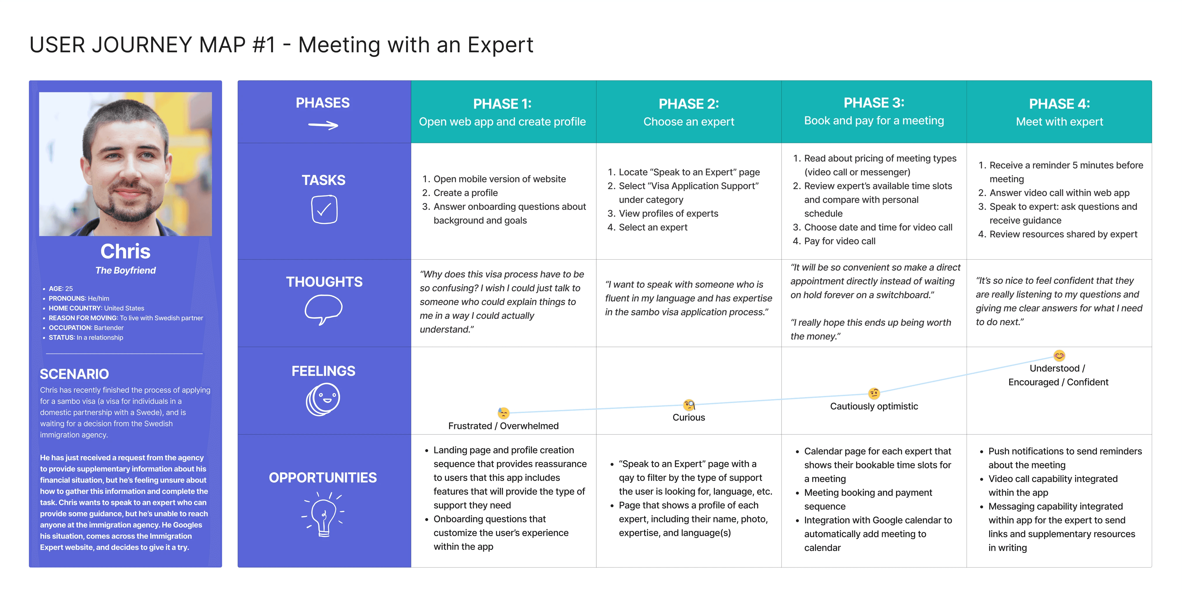
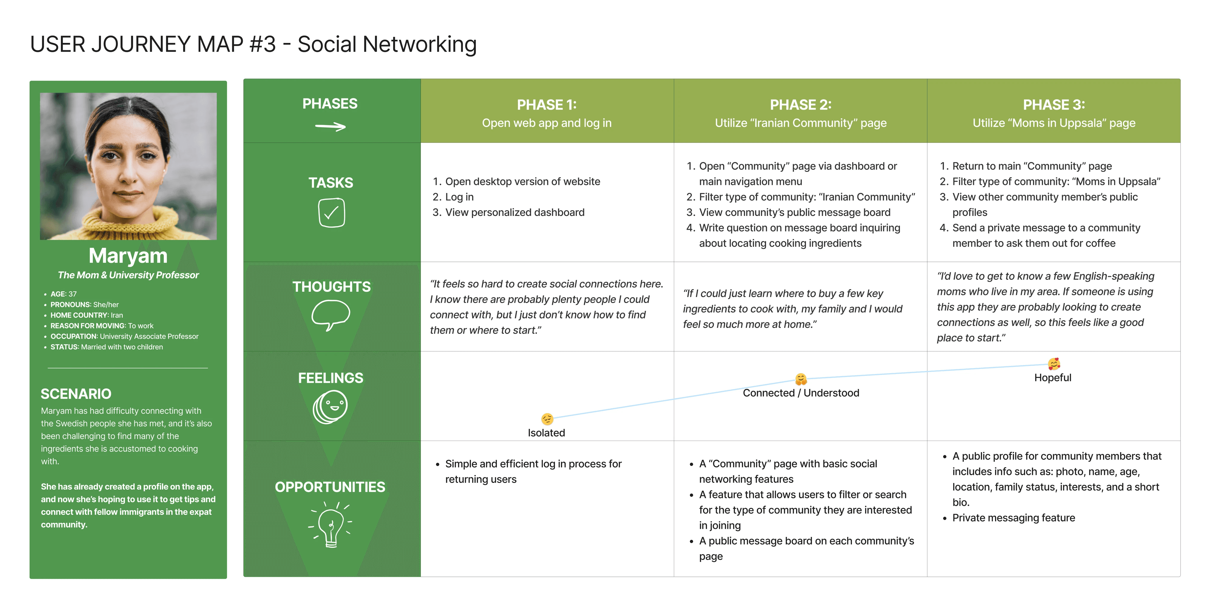
Maryam and Chris represent the most commonly held needs, goals, and frustrations of the individuals I interviewed and surveyed. This started to bring into focus the ways that the app could meet these needs.


02 DESIGN
I created user journeys to consider how people would feel as they progressed through each task.

User flows mapped out the individual steps involved in completing each task.

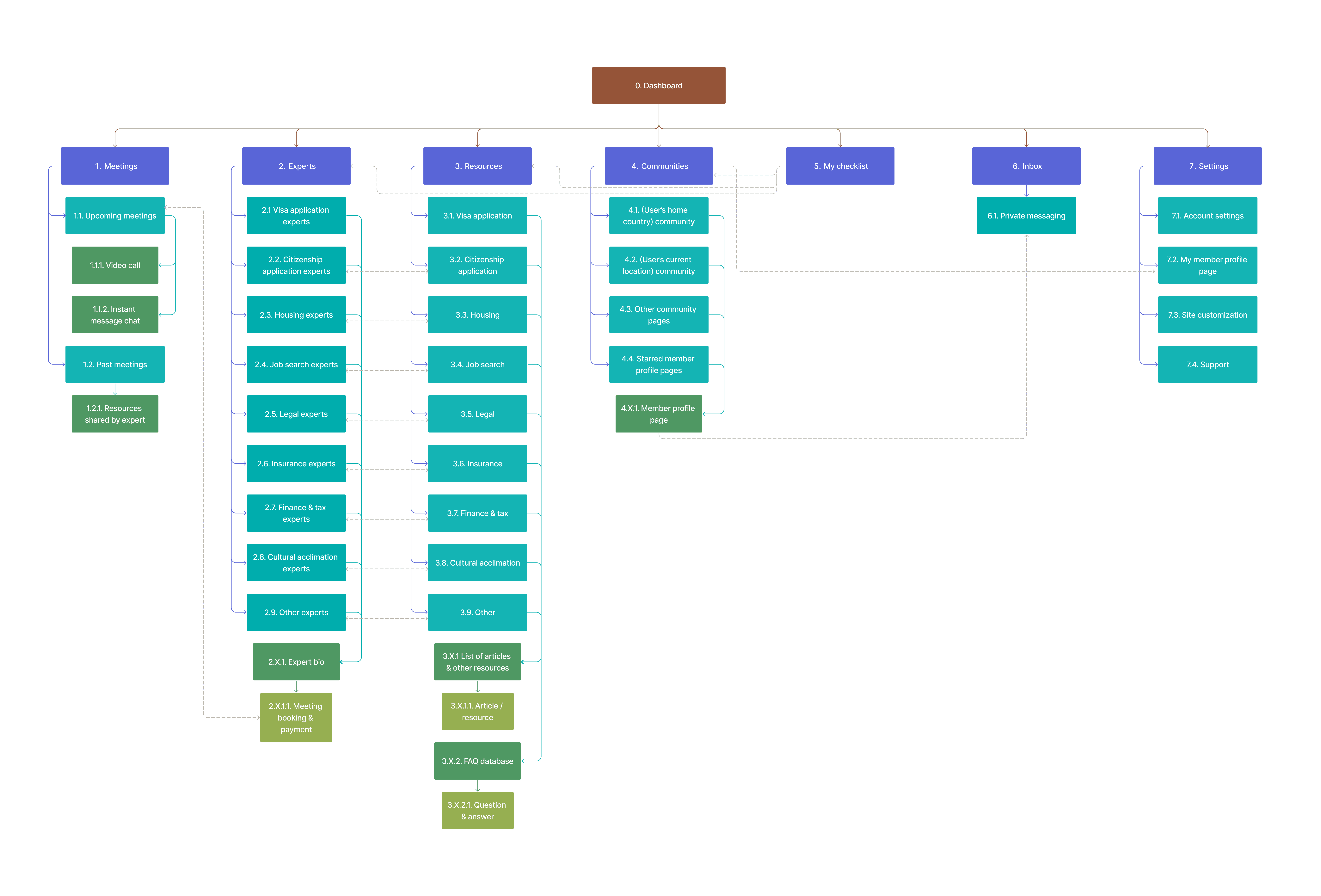
And a site map brought everything together in one comprehensive structure.
Finally, I created wireframes to plan out each screen's layout.
I sketched out low fidelity wireframes, then built an interactive mid fidelity prototype. The goal here was to map out the app's basic screen compositions and functionalities.


03 TEST
Armed with a basic prototype, it was time to conduct usability testing!
I conducted 6 moderated tests: 3 in-person and 3 remote. My goal was to find out how easily participants could navigate through the app's primary functionalities. Each person was asked to "think aloud" so that I could have some insight into their thought processes. I also carefully observed their body language and the way they progressed through each screen.
Participants were asked to complete the following tasks:
Complete the onboarding questions and tutorial
Book a meeting with an expert
Access a written resource
Access a community page and connect with another community member
I organized my observations to bring trends into focus.
Each user test was recorded so that I could review the footage for analysis. I pulled out the key insights and organized them into an affinity map (below) and a spreadsheet where I ranked errors in order of severity. This gave me a clear action plan for how to improve the app's functionality.

Based on these insights, I made a few adjustments to the prototype.
Problem:
One user stated that since the topic of immigration is so high stakes, they would be skeptical of who wrote the app’s content and whether the information could be trusted.
Solution:
The credentials of the authors/translators and original sources are displayed in each article. I've also included a note on the homepage about the credibility of the app's content writers.

Problem:
Two users attempted to start a private chat by tapping the “comment” icon, and one user was unsure about the function of the "heart" icon.
Solution:
I changed the icon styles and included an indicator showing the number of comments and likes left on a post. This will make it easier for users to infer the function of the icons.
04 REFINE
It was finally time to breathe some life into that interface.
I built the high fidelity prototype with these main goals in mind:
Create efficient user flows and intuitive interfaces that address the needs of my audience.
Utilize visual design and language that communicates a tone of credibility balanced with friendliness and warmth.
Consider ways to integrate AI in order to individualize the app content for each user's situation and needs.
Prioritize an accessible user experience for all individuals by mindfully selecting color palettes, UI styles, and language.
Here's what I came up with…
#1. An informative and welcoming onboarding experience.
Questions are limited to 1-2 per screen in order to reduce cognitive load and minimize touch points.
Based on the user's answers to these questions, the app is tailored to meet their specific situation (country of origin, destination, language, etc.) and needs (assistance applying for a visa, finding housing, securing a job, etc.)
#2. A clean and functional home screen that features a customizable checklist.
Upon logging in for the first time, the checklist is populated based on the user's answers to their onboarding questions.
All home screen content, including the daily tips and featured resources, is individualized in order to be applicable to the user's specific situation and needs.
#3. A frictionless way to book a meeting with an industry pro.
The user can easily filter the type of expert they're looking for by using a drop-down list of categories, or a search bar which includes speech-to-text functionality.
Choosing an expert is straightforward, with each professional's bio including their photo, credentials and transparent pricing.
The efficient booking process gives the user control over their meeting details.
The user can choose to add the meeting to their personal calendar and/or use the app's push notifications, making it easy for them to remember and show up to their future meeting.
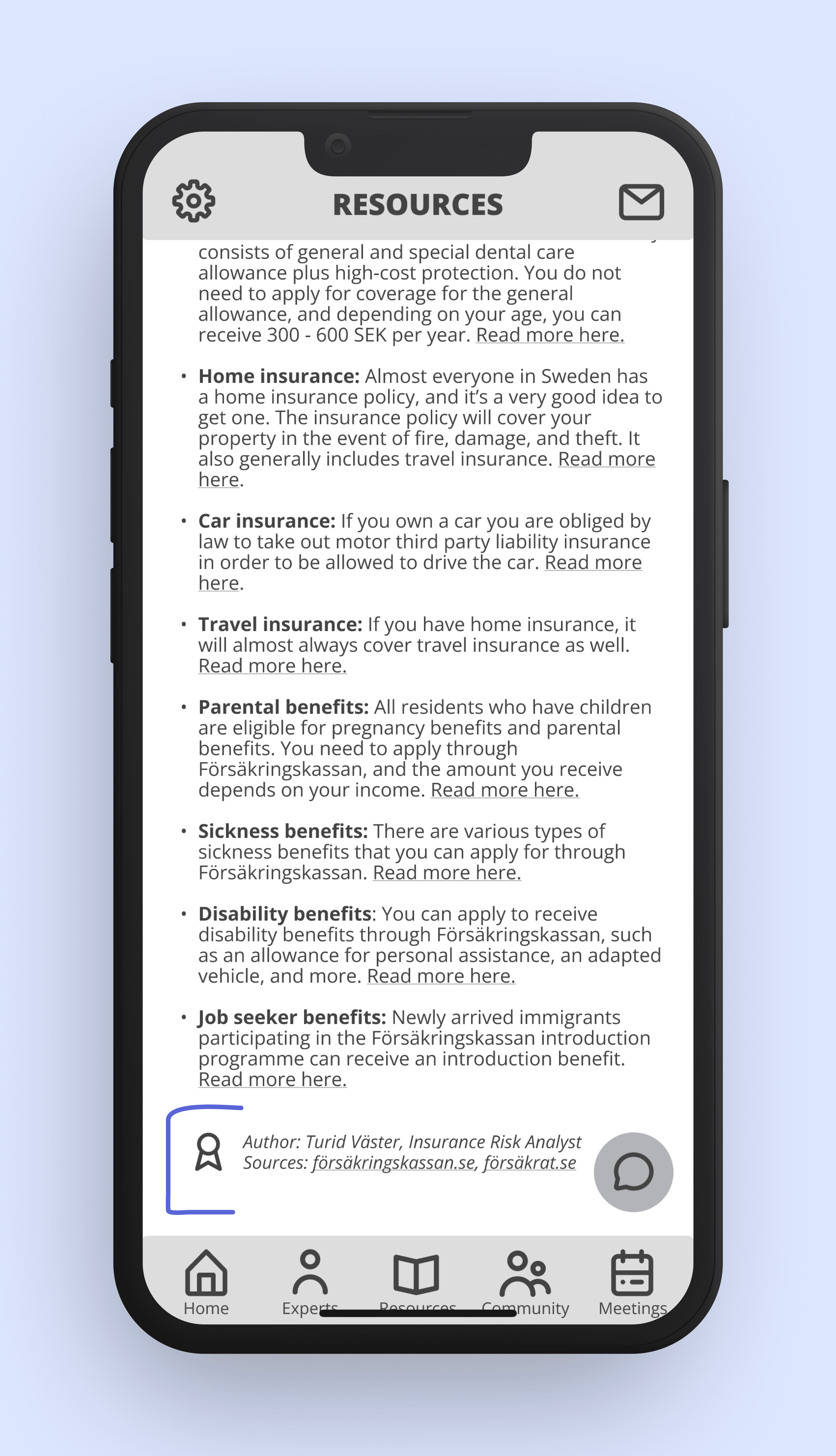
#4. A vetted, well-organized resource library.
The user can easily filter the type of resource they're looking for by using the accessible search bar or the drop-down list of categories.
All resources are written or vetted by industry experts, and their details are included at the bottom of each article.
#5. Access to a supportive community.
Members with common backgrounds or interests can easily connect with each other, and share valuable advice and camaraderie.
Users can choose to communicate via the group bulletin board, or through the private message feature.
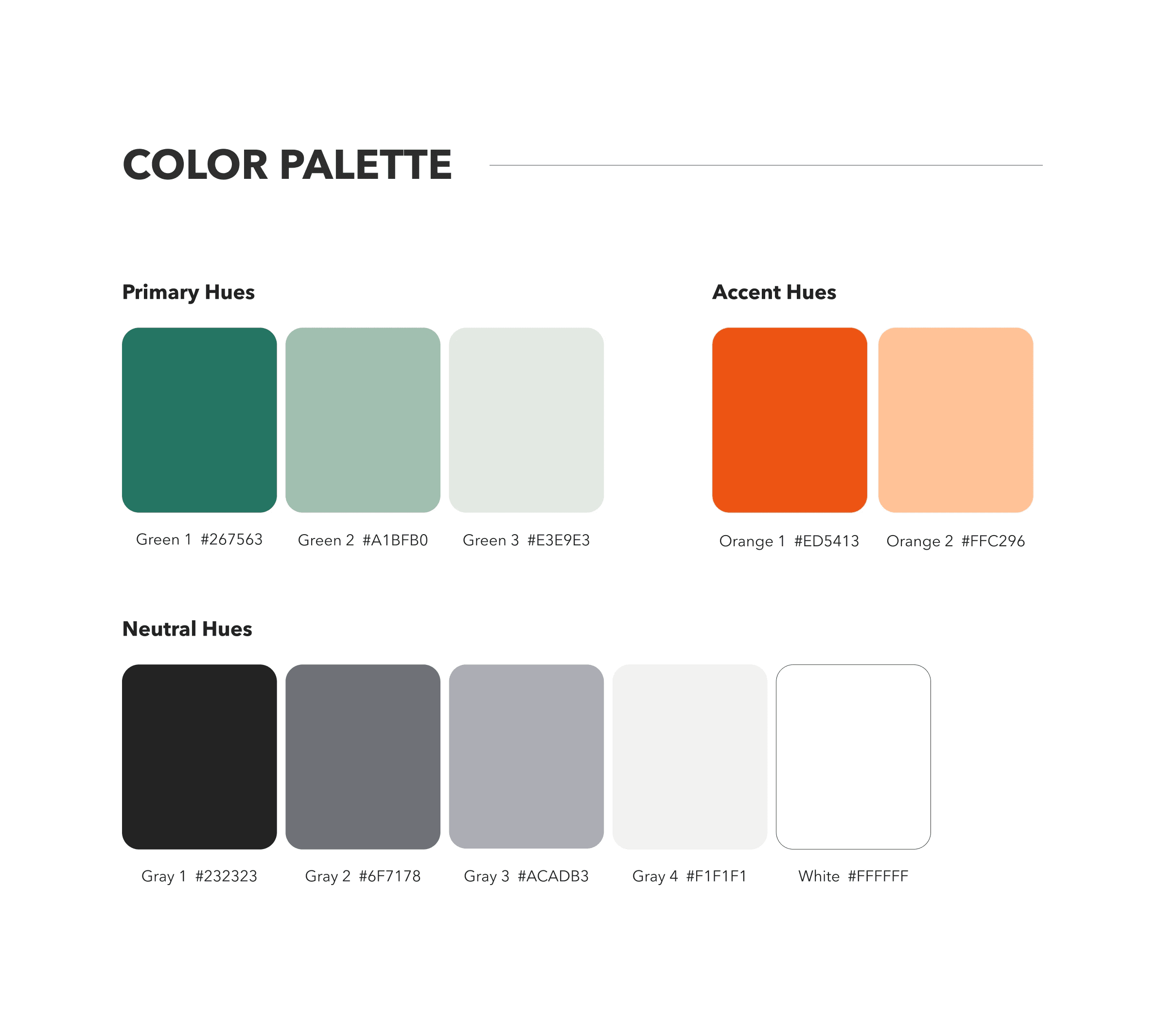
Lastly, I created a design language system in order to maintain organization and consistency.
Included in the system are guidelines for logo usage, color palette, typography, UI elements, iconography, imagery, screen layouts, copy, and accessibility.
05 REFLECT
Since this was my first UX project, I could write a novel about what I learned along the way. But here are a few takeaways in a nutshell:
Embrace the learning curve.
This was my first experience using design tools like Figma, so in an effort to expedite the design process, I initially attempted to teach myself how to navigate them. Although I learned a lot through this self-taught trial and error approach, the process would definitely have been more efficient (and less frustrating) if I had completed a course to get a handle on the basics before diving in to the design work.
Flexibility over perfection.
In my effort to make each and every deliverable "perfect," I created some double-work for myself when elements ultimately needed to be adjusted several times as the project developed. So in the future, I'll be mindful to prioritize simplicity and adaptability in order to maximize efficiency (while also still making things look nice, of course).
Human connection is king.
While being prepared with well-formulated questions is an important aspect of user interviews and usability tests, even more essential is approaching each person with genuine curiosity. When people can feel that I am truly invested in their perspective, they're more comfortable opening up and sharing their authentic experience. And that's when those brilliant ideas start to flow.