
Försäkringskassan
A refreshed and intuitive version of Sweden's social insurance website.
PROJECT OVERVIEW
The challenge:
Dealing with bureaucratic processes is hard. Especially if you're a busy parent.
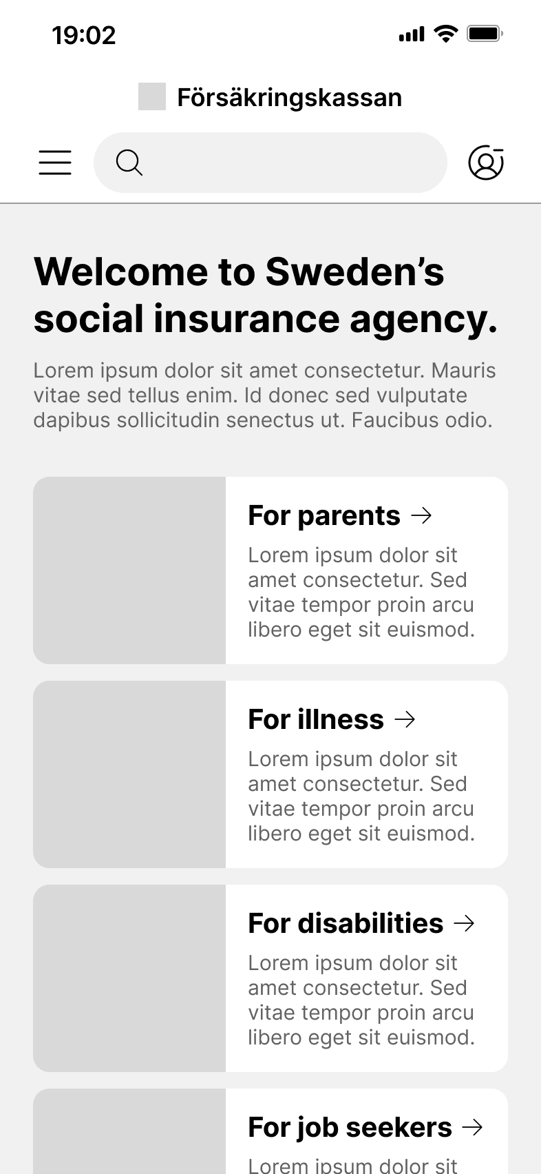
The social insurance agency website (Försäkringskassan) is used by all Swedish residents who are recipients of benefits like parental, unemployment, sickness, or disability compensation. I focused this redesign on the parental compensation section of the site.
The current site is difficult to navigate, particularly on a mobile device. The menu structure is complex, screens are crowded with text, and most tasks require several complicated steps. In addition, only select sections of the site are available in languages other than Swedish.
How might we address these usability and accessibility issues so that people are able to navigate the site with ease and complete tasks with confidence?
The outcome:
A clear and responsive interface that offers people a frictionless way to access information, services and applications related to parental benefits.


01 PLAN
First, I defined the project scope by creating user stories and user flows.
As a new user, I want to be able to easily log in and complete a simple and helpful onboarding process.
As a user who is not fluent in Swedish, I want to have full access to the site’s features in my own language.
As an expecting parent, I want to be able to apply for parental compensation quickly and confidently.
As an expecting parent, I want to be able to easily access straightforward information so that I can understand how the parental compensation system works.
As the parent of a newborn, I want an easy way to plan, schedule and track my parental leave.
As the parent of a young child, I want to be able to efficiently submit a compensation application whenever I stay home from work to care for my sick child.

Based on the goals of my users, I put together a list of feature requirements.
New user profile creation and onboarding that informs the user and customizes their user experience.
Sign in to personal profile using Mobile Bank ID (Sweden’s official digital identification system).
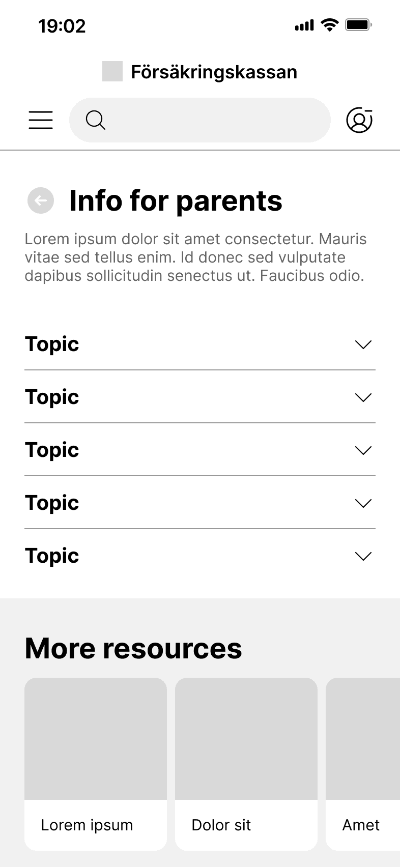
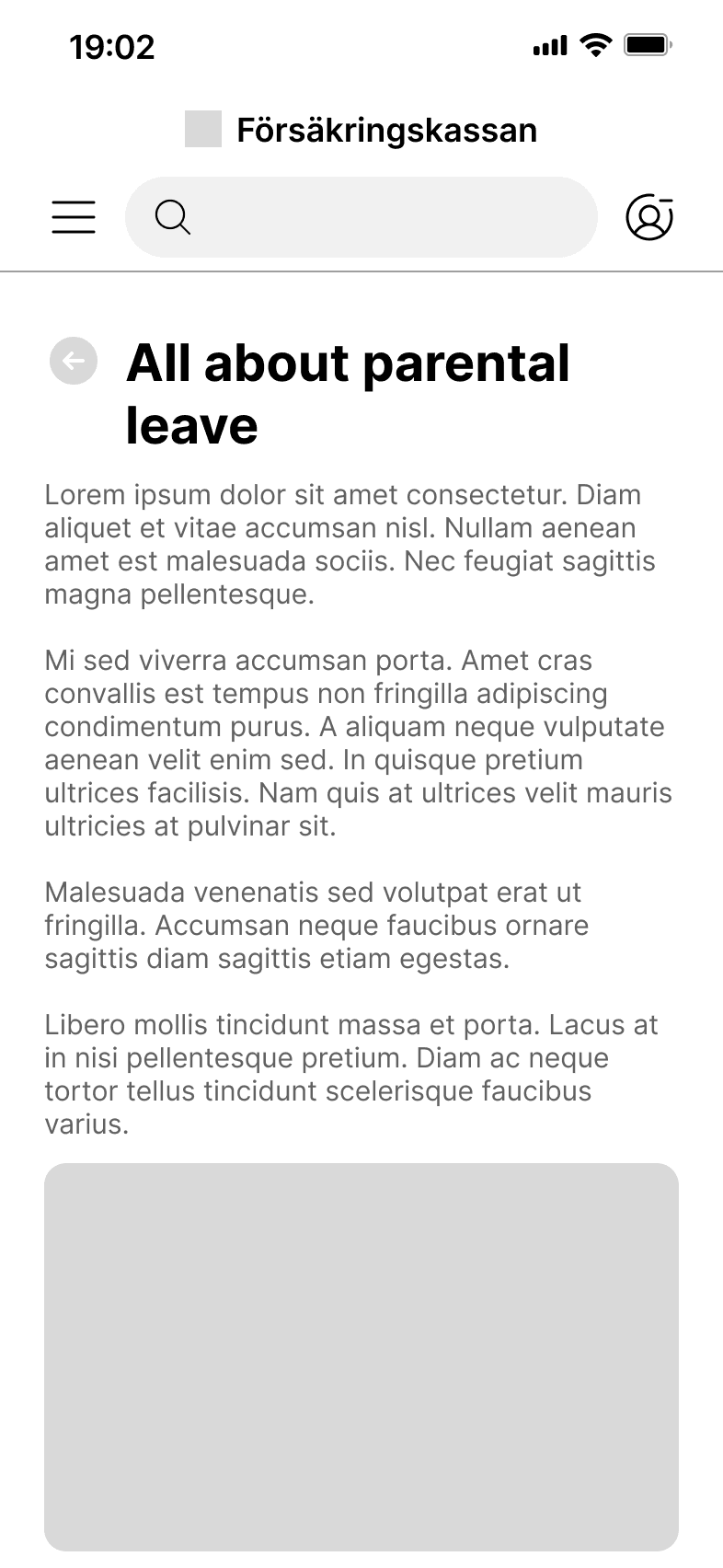
Information section that is searchable and easy to understand.
Compensation application process that is straightforward and efficient.
Parental leave scheduling feature that is quick and simple to operate.
Language setting that adjusts the user’s language across the full site.
Next, I brainstormed the project's aesthetic direction with a mood board.
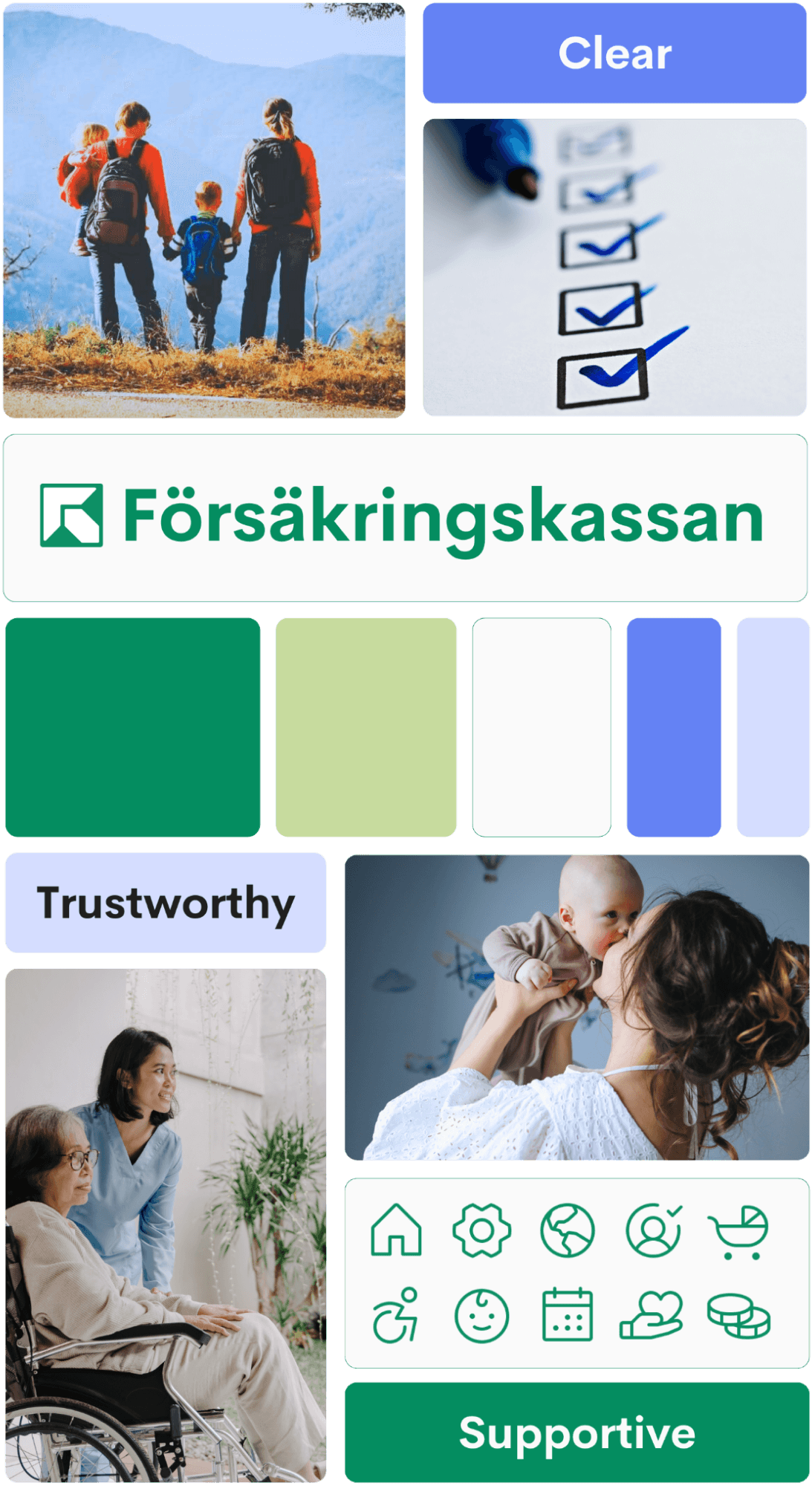
Bright and cool-toned imagery that depicts diverse and relatable people invokes feelings of connection, support and trustworthiness.
Cool green and blue color palette brings a fresh, crisp quality.
Minimalist and modern typography and iconography provide clarity.
02 DESIGN
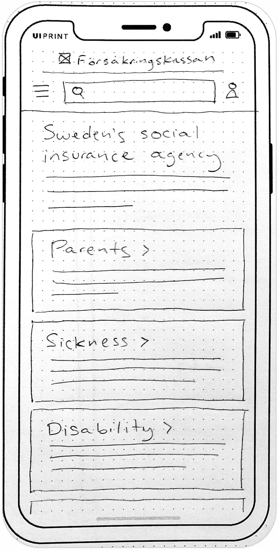
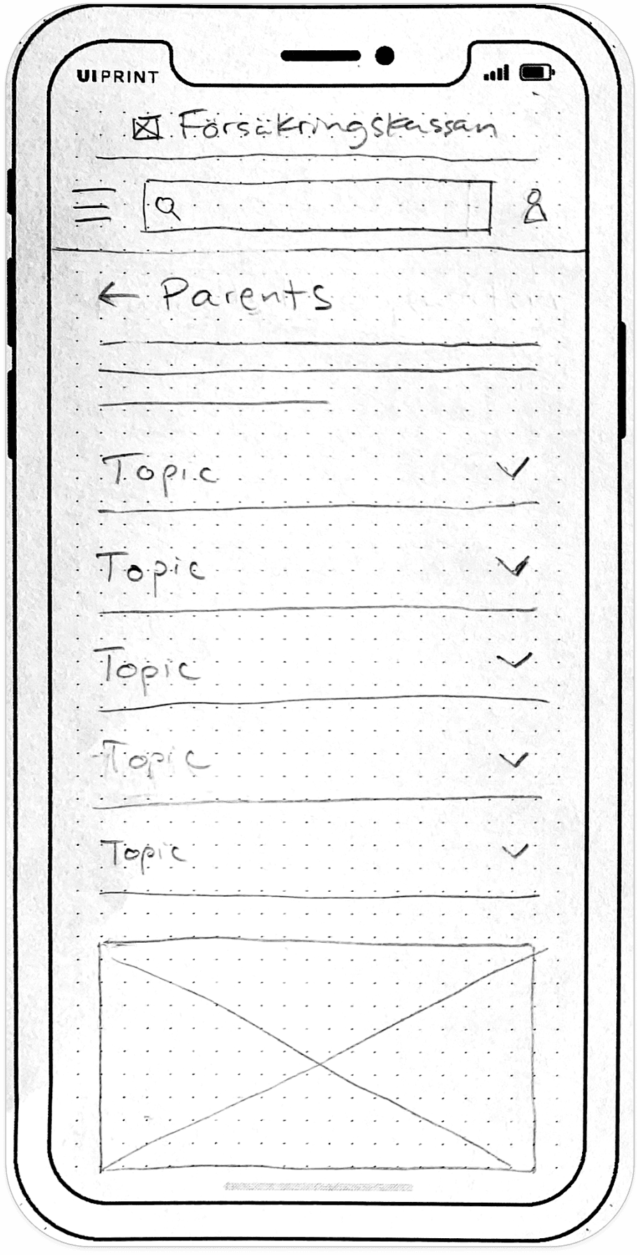
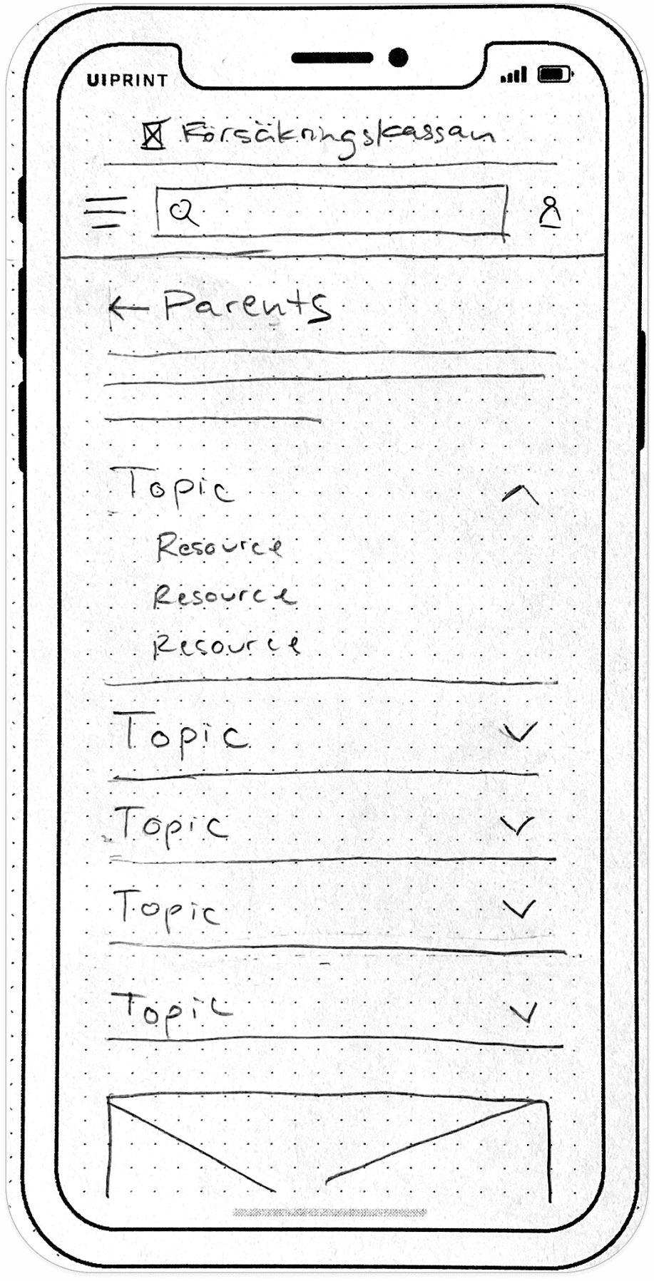
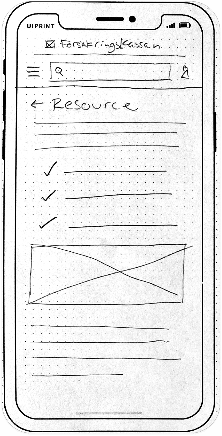
I started to plan out the interface by sketching low fidelity wireframes.
Then, I built them out as mid fidelity wireframes.

I faced a few particularly tricky design challenges, including:
A graph that communicates a user's remaining parental leave.
My first redesign was a donut graph, similar to the original. But after some informal user testing, I received feedback that the graph was too complicated and not easily understood. So, I redesigned a second version, opting for straightforward progress bars with clear text explanations.


A date picker that allows users to schedule their parental leave days in two different ways:
Date range selection: for people who need to schedule several consecutive days, weeks, or months of parental leave. A way to specify the days of the week was necessary as well, since a typical leave schedule is 5 days or less per week.
Individual date selection: for people who need to schedule individual, non-repeating days of parental leave.
I decided that a toggle to switch between the "Date range" and "Individual date" interfaces, similar to the original design, would function best. I then added in a modal overlay for the calendar along with dropdown lists to eliminate the need for scrolling.


Finally…color, images, and animations brought the high fidelity mobile prototype to life.
A fully responsive design was a critical step in ensuring a smooth user experience, no matter the device.


Last but not least, I created a style guide to maintain a consistent visual experience throughout the project.


03 REFLECT
Looking back
I chose to redesign Försäkringskassan's website because of my personal experiences navigating the site, as well as hearing friends and family express aggravation as they struggled to do the same. I decided to challenge myself to do something constructive with that frustration.
Over the course of the project, I learned that most of the time, the best solutions are the simple ones: Instead of a complex donut chart, a set of basic progress bars communicates the information most clearly. Instead of a wordy application form, some carefully crafted and concise questions are most efficient. Instead of colorful illustrations, a minimal color scheme with authentic photos of people are most effective.
Looking ahead
Even though this was an independent redesign that won't be implemented by the agency, I learned so many things throughout the design process that I'll be able to take with me into my next projects.
This site that's used by so many parents now has the potential to bring ease — and maybe even some enjoyment — to their busy days.
