This AI-powered customer support dashboard got a major makeover, resulting in improved usability and conversion rates.
The challenge: The original dashboard used inconsistent visual design elements and unclear copy, resulting in uninspired users and low upgrade rates.
BEFORE

8 key changes that made a powerful impact:
1. Trial countdown and CTA
The prominent yet non-intrusive top banner features a countdown timer displaying the time remaining in the free trial, and a CTA encouraging users to upgrade.
This provides immediate transparency about the trial length and creates a sense of urgency that will nudge users to upgrade.

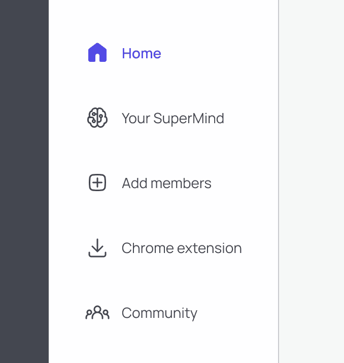
2. Consistent iconography
All navigational icons use a cohesive minimalist and rounded style. Inactive icons are linear and grey, and active icons are filled with the primary brand color.
This creates visual harmony, improves user understanding, and reduces friction.
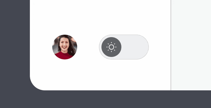
3. Light and dark mode toggle
Users can easily switch between light and dark mode within the main navigation.
This enhances the user experience by giving individuals control over their visual comfort and helps them feel more connected and cared for.
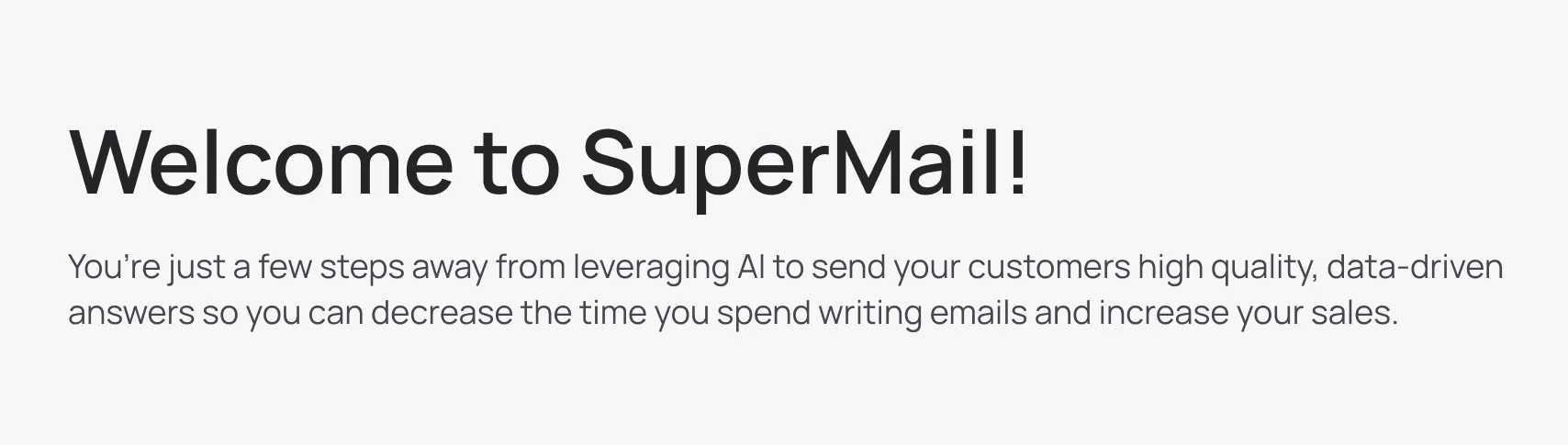
4. Motivational subheader
A welcoming subheader reminds users of the capabilities of SuperMail and emphasizes how easy it is to get started.
This motivates the user to take action, integrate the product into their workflows, and eventually become a paid user.
5. Clear action items
Users’ choices for how to get started are clearly defined in card format. Each option descibes the benefits of taking the action along with a prominent CTA button.
This clarifies the specific ways SuperMail can assist the user, and gives them confidence about what steps they need to take in order to successfully get started.

6. Accessible FAQs
A link to FAQs is prominently located, along with examples of questions that many users will want to resolve before taking steps to use the product.
This creates trust and confidence, reduces friction, enhances user self-sufficiency, and improves the overall user experience.

7. Social proof
A testimonial carousel is displayed at the bottom of the dashboard home page along with a CTA to upgrade.
This reminds free trial users that others have successfully benefited from the product, reducing their perceived risk and increasing their confidence in making a purchase decision.

8. Color variables
By using color variables, it's easy to toggle between dark and light modes within the prototype.
This keeps the design consistent and will make it a breeze to continue expanding it in the future.

